Sunday, February 28, 2010

Before and After: The off-center fireplace syndrome

After
We're starting with the after picture for a change. Although we aren't completely done with the "decorating" in the living room, the carpenters, painter, carpet layers, fireplace specialists, granite layers, and even the upholsterers are gone. It's the fine tuning that takes a while (that's not to say the remodel didn't!). We'll be adding some things to hang on the wall, different pillows, and another chair and table, but the big stuff is finished. And if you've been following along, this is the living room that is connected to the kitchen from the previous post.
Before (left side of fireplace)
It might look centered, but you'll see in the picture below that the hearth ran along the wall to the doorway, making the whole wall a problem.


Before (right side of fireplace)
So at some point, a cabinet was built on top of the hearth---something needed to go in that spot!
So when you scroll back up to the first picture, you'll see a beautiful hutch in the green cabinet's place. It was originally on the other side of the living room, but not really appreciated since it was only viewed from the side when you entered the room.

In reality, the fireplace is still off-center--there is more space on the right than the left, but it does appear to be centered to the living area. The furniture in the "before" shot is the same furniture in the "after" photo. They are wonderful pieces handed down (as the hutch is) to the homeowner. We found some updated fabrics and had them re-upholstered. We'll show better pictures (close-ups) in a future post.

If you're wondering, the wall color is now "Compatible Cream", a Sherwin Williams paint color. The trim is custom matched to the doors in the home. The ceiling color was made slightly creamier than the trim so there would be more definition between the two.


Saturday, February 20, 2010

Kitchen Remodel---after pictures

Remember the kitchen remodel of before, during and during? It's finally into the truly "after" phase, although don't ask the owner, she may not agree!!! Minus a table, chairs, and cushions, we are there. But, aren't we all always trying to improve on what we have, whether it's re-organizing the pots and pans, or just adding a new throw rug.

Remembering the "Before"


Loving the "After"

What we did: The soffit was the first to go---it just seemed to date the kitchen, and if you're going to replace the cabinets, why not use the extra space for storage (you don't have to use the top shelf for everyday)! The tile floor is new, along with the granite counter top, awesome stainless appliances (except for the fridge), and the counter next to the breakfast area was raised to serve as a bar counter. Wish I had a close-up of the backsplash with the tiny glass tiles running through as an accent. They really are made up of many different colors and are a bit of splash next to the tumbled style tiles. The light above the sink is fun as well, with polished stones embedded into the fixture. The window seems larger with the soffit gone and the new roman shade mounted several inches above the frame.


Small nook "Before"

This little area served as a make-shift office area: not large enough for a true message center, but small enough to catch everything else.


The "After" grew up to be a built-in Hutch


With the collection of dishes Mrs. Smith has, it seemed necessary to add some glass to the kitchen to show off the collections. She does use these dishes quite often, and they are very handy to the table, but also serve a decor when not in service. The brick wall was covered with sheetrock which eliminated the busy look of the rough, red bricks.


And the fridge, which used to house numerous photos, is now just part of the lovely scenery! Notice the set of drawers next to the fridge: the hole in the brick wall housed a double oven at one time. While it would have been nice to have one, the size was no longer available, and the thought of a jackhammer into the brick wall was not appealing. The deep drawers are now added storage.


Thank you, Mrs. Smith, for letting MLI help in your beautiful kitchen remodel. And to everyone else, stay tuned, we did redo the living room, too!!

And while we're at it: thanks to Brenda at Deans Custom Cabinets for all your help and patience, and always thanks to Calvin of CE Barnard Construction.

Monday, February 15, 2010

More wall art coming to Madison Lane

We are so anxious to get our order from The Ashton Company. They are another company we picked up at the Atlanta Market. What a huge assortment of framed art they have---and with the ability to change the frames and mats if you choose to! Here's just a few that we will have shipping out on Friday:


Of course the true beauty of these cannot be appreciated on-line. Their website is just a teaser, we think you'll be drawn to these just as we were in the Ashton showroom.

Since "shipping out on Friday" can mean a lot of different things, feel free to call us when you think they should be here!!!

Sunday, February 7, 2010

Upcoming billboard is a joint venture

Our best advertising dollars, to date, has been the billboard on 2nd and Main Street. The arrow always points the way to "4 blocks west" and we intend to keep that same message. We recently partnered with our friends Julie and Jon at Calotype Photography on the next billboard.

This will be the picture on 2nd and Main for awhile. We are hoping people will see we are a friendly store, and feel more inclined to stop in and look around. I also hope we can stand to see ourselves on the "bigger than life" billboard for the next few months!

Thanks so much to Calotype Photography for working with us---they really make the whole picture taking experience fun, and we thought that would be impossible. Take time to look through their blog and visit their Facebook pages, too. You'll be very impressed. We hope they'll benefit from the 2nd and Main Street billboard as much as we have.

Wednesday, February 3, 2010

Dining Room Drapery: Choosing the fabric

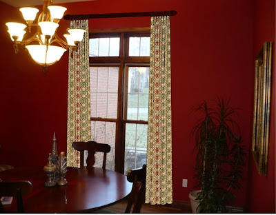
Here's the "naked" dining room, or to some people it is! Maybe saying it's "undressed" is a better term. It really is a lovely home, with beautiful red walls in the dining room, wonderful tall window, and is open to the living room which is painted a khaki tan (not officially the name). Other decor in the room is an antique hutch which is more medium in color as is the rest of the wood. The request of the client is the need for some sun control during holidays dinners, which she serves in the formal dining room. Total blackout is not need, but something to take the glare off. The only other request was that it not be mounted inside the window frame.

Rendering #1
Do you like fabric with a darker background?


Rendering #2
Or, do you prefer the lighter background?


The drapery will extend past the window frame so the view will remain intact. The hardware will be an iron rod/rings/finials, and the color chosen will be a close match to the light fixture. We are deciding on the fabric, which has been narrowed down to some beautiful paisley prints. Some have creamy background, while several have more brown tones for the background color.

We sent the top contenders home with the client to view in all hours of the day (and requested that she keep them until the sun shines again!). The next step will be choosing a coordinating fabric to cover the dining room chair seats and for the window treatments we want to add to the living room.

OK, have you made a decision? Feel free to leave your ideas and comments. We'll keep you posted on the outcome.


LinkWithin

Blog Widget by LinkWithin